Skip to content
Flyout Menu
Who We Work With
Who We Are
Contact
🔎︎
Lisa Jilek named Brandpoint CEO
Written by
MaDonna Sheehy
What PR Teams Need To Do When Economic Uncertainty Challenges Their Efforts
Written by
MaDonna Sheehy
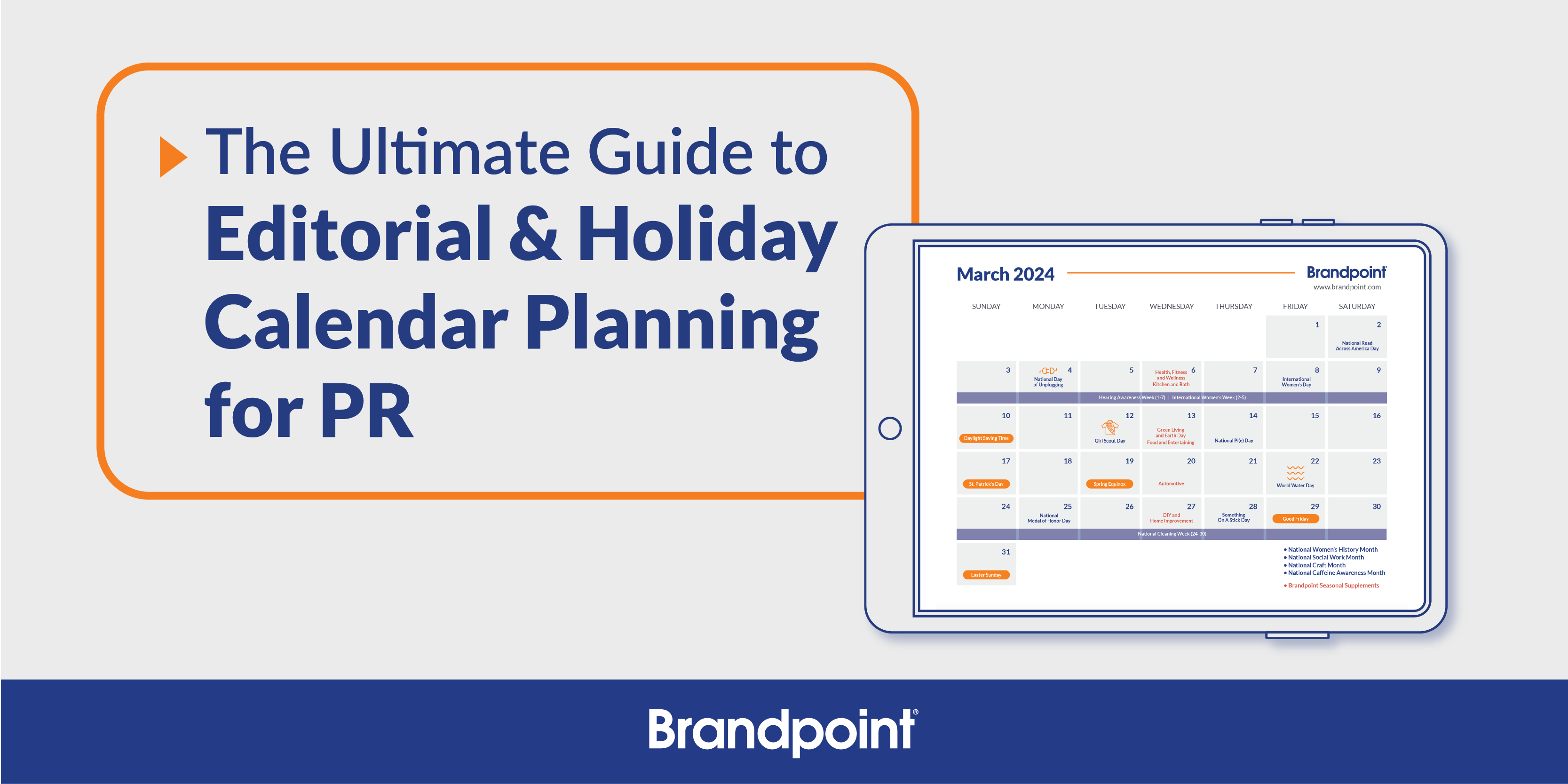
The Ultimate Guide to Editorial & Holiday Calendar Planning for PR
Written by
Brandpoint
How to Use Paid Placements to Streamline Your PR Efforts
Written by
Wendy Webb
Expert Insight on the Future of Branded Content
Written by
Laura Malm
3 Ways to Save on Media Placements and Maximize ROI
Written by
Hannah Pawlak
How To Make The Most of Your Media Placements: 8 Expert Tips
Written by
Laura Malm
5 Standout Branded Content Campaigns
Written by
Wendy Webb
The 10 Best Ways to Use Branded Content
Written by
Wendy Webb